Color may catch the eye, but texture holds the heart. When a home is built around tactile integrity rather than visual trends, it feels balanced, grounded, and quietly luxurious.
Why Texture Speaks Louder Than Color
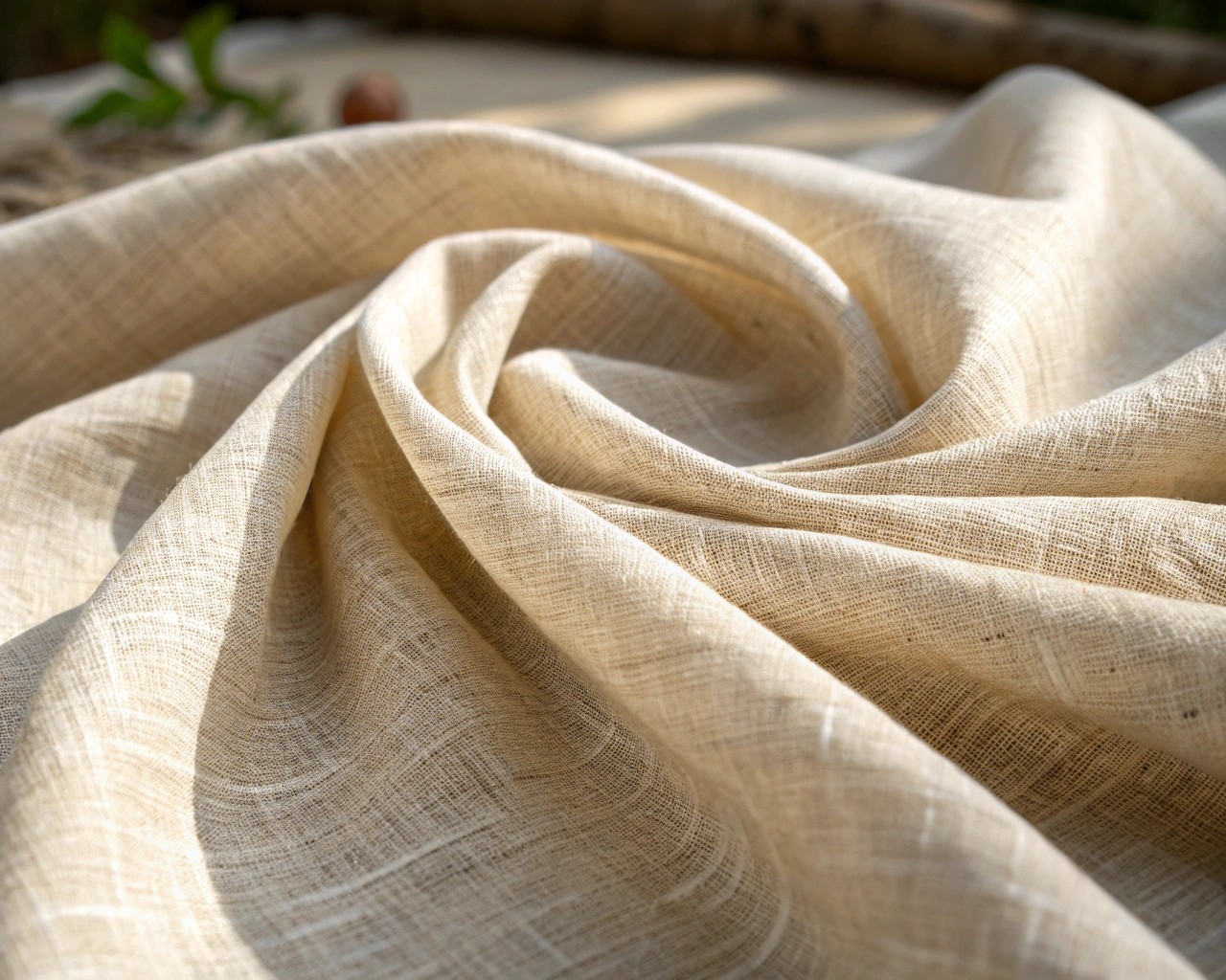
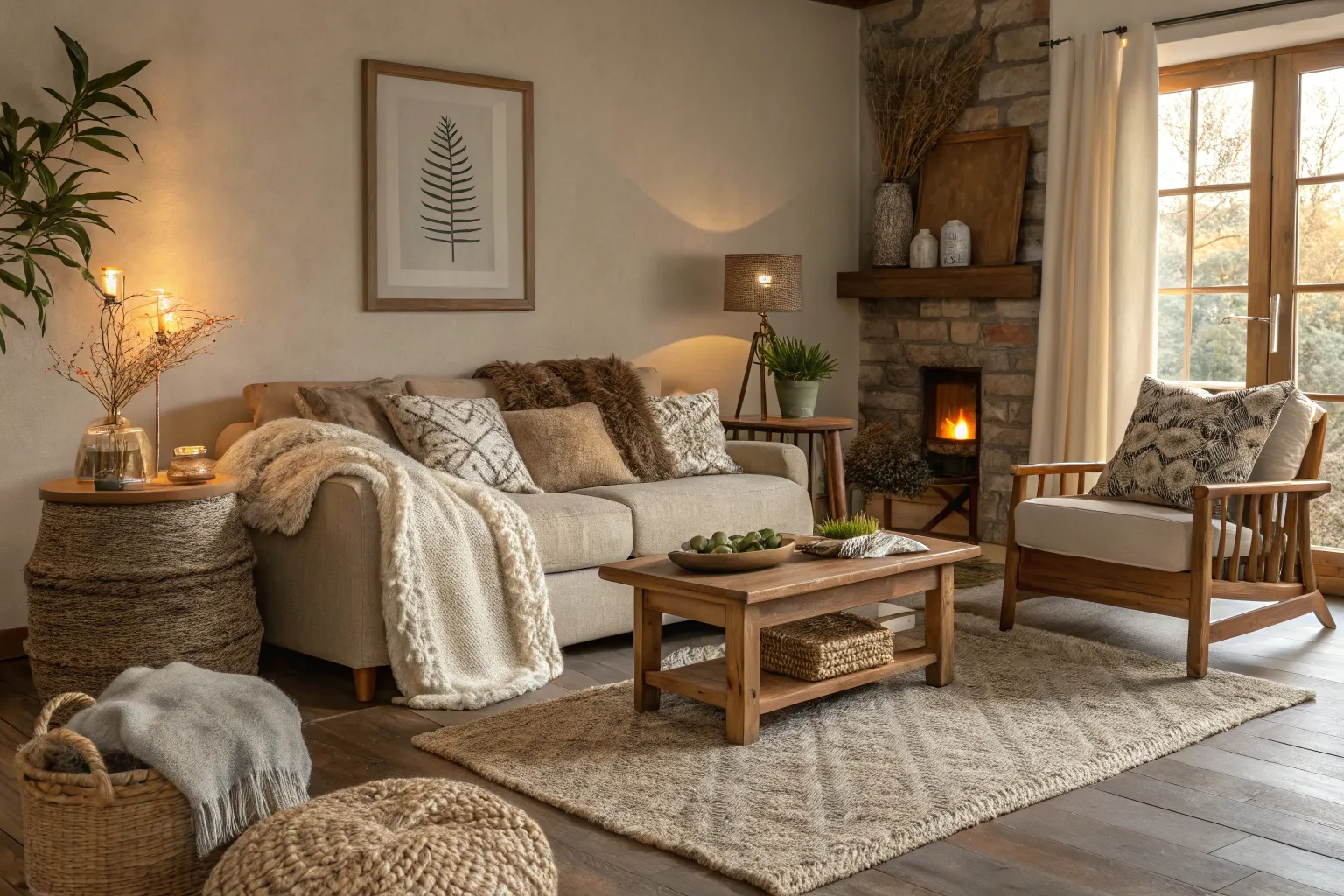
Color defines mood; texture defines atmosphere. The subtle irregularity of hand-planed oak, the soft weave of linen, or the mineral coolness of limestone flooring all speak through touch as much as sight. While color is a surface phenomenon, texture changes under light, age, and use—it develops a patina that reflects time and authenticity.
From my own experience, rooms built around texture rather than hue tend to age better. Their character deepens instead of fading with fashion. You can repaint a wall at any time, but you can’t mimic the honesty of worn wood or natural grain.
The Case for Wood as Foundation
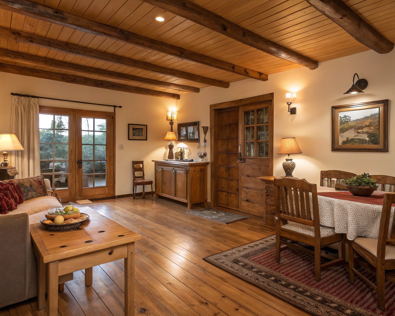
Wood remains the most emotionally resonant material in design. It carries warmth, heritage, and the human touch of craftsmanship. Whether you work with solid timber or veneer, birch or walnut, wood sets the visual rhythm of a space—and becomes a neutral base that welcomes other materials.
| Element | Suggested Material & Finish | Design Effect | Maintenance Tip |
|---|---|---|---|
| Flooring | Wide-plank oak, oiled or smoked finish | Grounds the space; enhances natural light | Clean with pH-neutral soap; re-oil annually |
| Walls | Slatted panels, reclaimed pine boards, or veneer sheets | Adds dimension and acoustic comfort | Avoid high humidity; seal back panels |
| Ceilings | Exposed beams or ribbed wood panels | Adds vertical warmth | Brush clean; avoid heavy lacquers |
| Furniture | Mixed grain textures—ash, cherry, or walnut | Encourages contrast and depth | Use beeswax polish, not silicone |
| Trim & Details | Edge banding or carved accents | Unifies theme | Keep consistent tone range |
Design insight: I often select wood first, then build the palette outward. Once wood defines tone and warmth, all other materials—textiles, stone, leather—become supporting actors.
Start with Surface, Not Shade
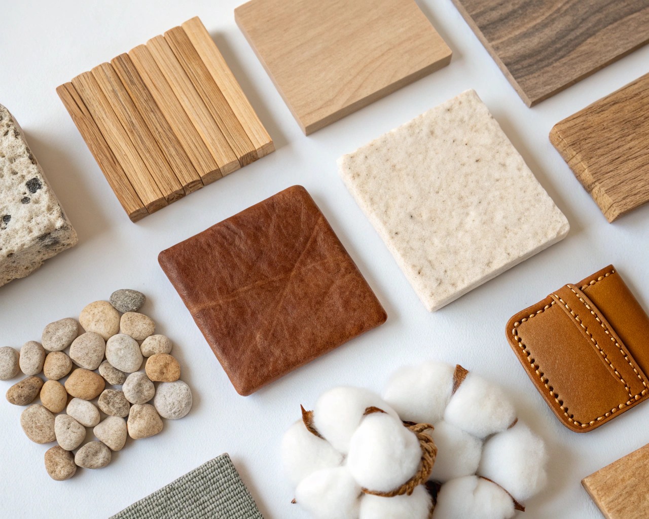
Designing with surface first means beginning where the hand meets the home. Instead of pulling swatches of color, gather actual material samples:
- Lay them flat in natural light. Observe how each reacts at different times of day.
- Organize by finish: matte, brushed, woven, and polished.
- Notice transitions: how a coarse jute rug plays against smooth maple or how soapstone counters ground glossy cabinetry.
- Then select color—pale clays, muted greens, smoky whites that highlight the existing textures rather than compete with them.
Texture-driven design often uses a quiet color language where contrasts come from material personality instead of paint. Whitewashed oak beside black steel reads dynamic even within a neutral palette.
Layering Natural Textures with Purpose
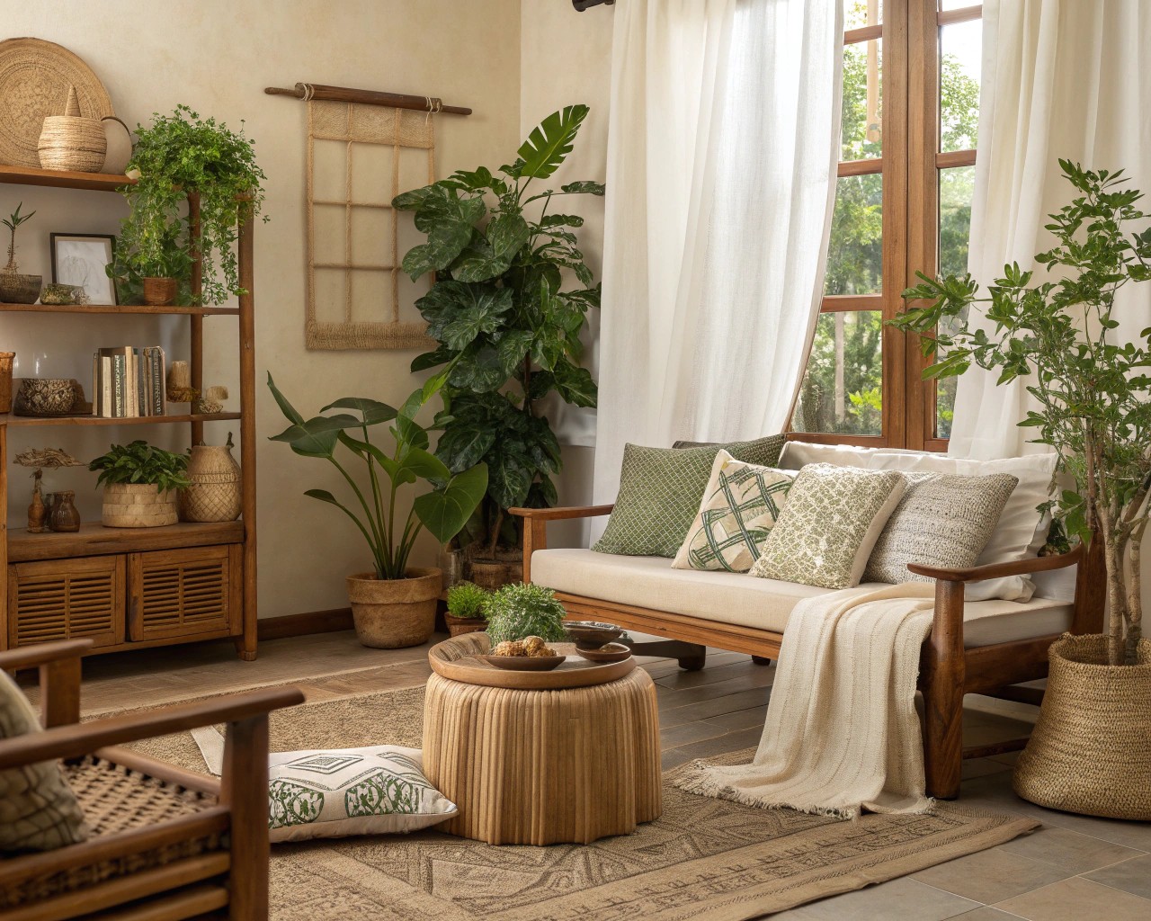
Think of your interiors the way you might plan a garden—some areas offer structure, others yield softness or subtle irregularity. The art lies in layering:
- Structural woods (floors, cabinetry) form your canopy.
- Organic fibers (linen, cotton, wool) add a tactile mid-layer.
- Mineral elements (stone, clay, ceramic) ground and stabilize visual rhythm.
- Botanical accents (plants, dried stems) bring contrast and imperfection.
Example combinations that balance touch and tone:
| Setting | Base Texture | Contrast | Third Accent |
|---|---|---|---|
| Living Room | White oak media unit | Charcoal linen sofa | Terracotta pots |
| Bedroom | Walnut headboard | Wool boucle throw | Cane bedside table |
| Kitchen | Birch cabinetry | Soapstone countertops | Brass hardware |
Pro tip: Mix finishes consciously—too many similar surfaces feel flat. I use a “two-one-one” rule: two dominant textures, one accent, one subtle echo.
The Science Behind Tactile Comfort
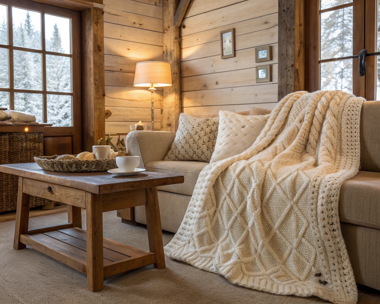
Natural surfaces quietly improve how a room feels—physically and emotionally.
– Thermal balance: Wood and wool retain warmth yet breathe, helping rooms regulate temperature naturally.
– Acoustics: Uneven, porous materials absorb sound irregularly, reducing echo and promoting psychological calm.
– Visual fatigue: Textured surfaces diffuse light, creating more soothing environments than high-gloss interiors.
– Biophilic response: Humans instinctively relax around organic irregularities. Neuroscientists call this the “tend-and-befriend” effect—a calming physiological reaction to natural stimuli.
So when you choose hand-finished oak over lacquered panels, you design not just a look, but a sensory habitat.
Styling with Restraint
Texture demands air and light to breathe. Overfilling a room flattens the tactile dialogue. Instead, aim for simplicity with deliberate detail:
- Leave negative space to let surfaces interact.
- Use daylight as a texture amplifier: raking light across vertical grain reveals dimension.
- Favor oiled, waxed, or unfinished woods over plasticized coatings.
- Maintain tonal continuity—contrast through gloss and grain, not random color.
When I style a room, I often add a single “imperfect” piece—a roughly hewn stool, a clay jug, a woven wall hanging—to offset precision. These small gestures break the predictability and make the design approachable.
Harmonizing Multiple Wood Tones
Many hesitate to mix woods, but contrast brings authenticity. Just as in nature, variation feels organic if underpinned by cohesion.
How to do it well:
- Stay within one undertone family—warm (oak, cherry, walnut) or cool (ash, maple, birch).
- Use one dominant tone for architectural surfaces, then add one or two supporting tones at smaller scales.
- Repeat each tone at least twice in the room for rhythm.
- Balance light and dark wood with neutral upholstery or mineral textures between them.
A simple rule: if two woods differ in tone, separate them with a buffer material like metal, fabric, or stone.
Caring for Natural Finishes
The beauty of texture lies in its maintenance. Materials that show use also show life.
| Material | Routine Care | Renewal |
|---|---|---|
| Solid Wood | Dust with soft cloth; wipe spills immediately | Re-oil every 6–12 months |
| Leather | Condition seasonally; keep out of direct sun | Buff with neutral wax |
| Linen | Machine wash cool; hang dry | Expect subtle softening over time |
| Stone or Concrete | Apply natural wax or soap seal | Sand lightly to refresh |
| Rattan | Brush clean; avoid high humidity | Tighten joints if sagging |
Proper care enhances patina instead of hiding it—the real essence of texture-based interiors.
Starting Small: Everyday Tactile Shifts
If full renovation feels daunting, introduce tactile change gradually:
- Swap glossy furniture for matte, oil-finished wood.
- Replace synthetic textiles with cotton, wool, or flax.
- Choose ceramic over plastic for everyday objects.
- Add layered window treatments—linen sheers plus wool drapes.
- Bring in scent and sound—crackling wood, beeswax candles—to complete the tactile story.
Step by step, texture rewires how your home feels.
Closing Thought
A home built on texture rather than color never rushes to impress—it invites connection. Natural surfaces speak softly but with depth, offering continuity between the material world and human experience. Over time, scratches, polish marks, and worn edges become the diary of a life lived well—proof that texture isn’t a design choice, but a lived one.

