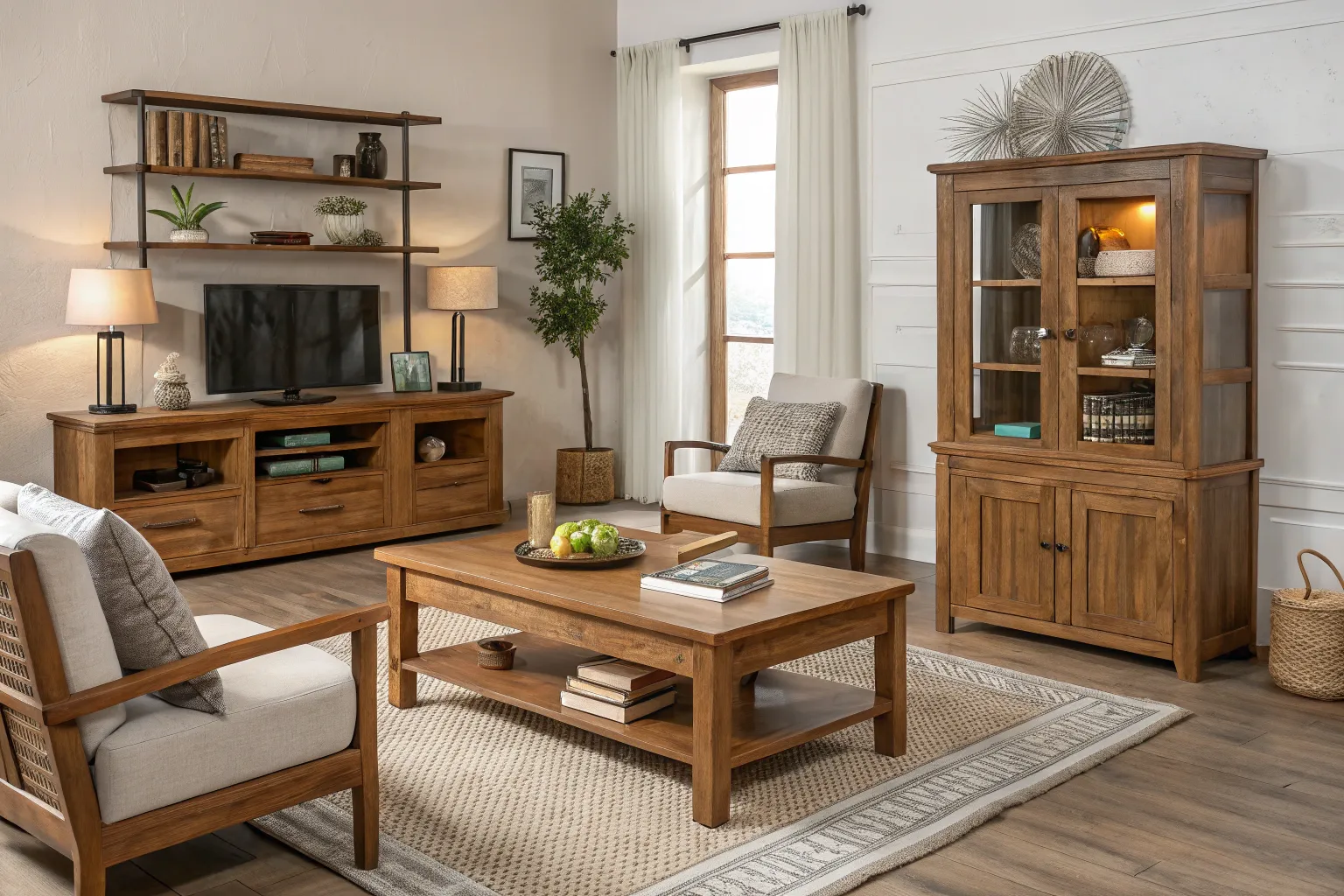
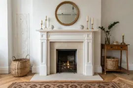
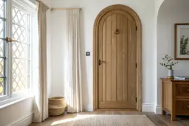
Mixing wood tones is one of the most rewarding design choices you can make—if done thoughtfully. A mix of finishes, grains, and colors brings depth, character, and authenticity to a space. But it can also feel overwhelming fast. Here’s how to strike harmony without losing the natural soul of your home.
1. Begin With a “Key Wood” Foundation
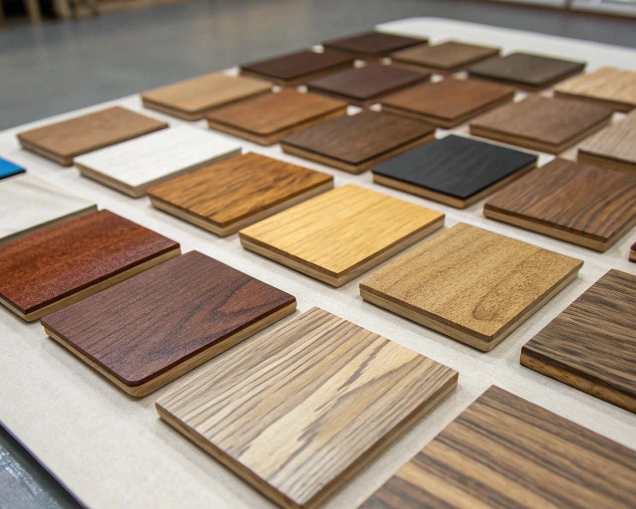
Every wood-rich space needs a visual anchor—a key wood that leads the palette. This may be your flooring, a dining table, or millwork. Once this dominant tone is set, the rest of the woods should orbit around it like supporting characters.
How to choose your anchor tone:
- Observe the largest surface. In most homes, flooring takes up the most visual real estate. Start there.
- Define its temperature. Warm woods like cherry, mahogany, or oak have red or golden undertones. Cool woods such as maple, ash, or gray-stained pine lean more neutral or blue-gray.
- Decide the atmosphere. Warm tones feel inviting and traditional; cool tones feel serene and contemporary.
I often lay samples on the floor next to fabric swatches and light fixtures. Seeing how daylight shifts their colors helps me sense which tone naturally wants to lead the room.
Once the anchor is chosen, limit yourself to two or three supporting woods that enhance it, not compete with it.
2. Match Undertones, Not Species
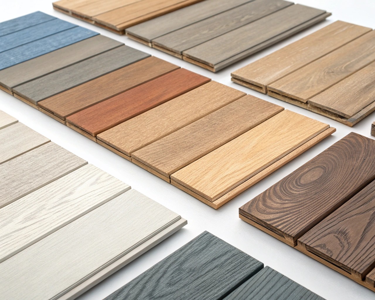
Many people assume matching species (oak with oak, walnut with walnut) guarantees cohesion—but it rarely does. Trees of the same species can vary widely depending on age, finish, and cut.
What actually matters is undertone.
| Undertone Family | Common Woods | Works Best With | Avoid Pairing With |
|---|---|---|---|
| Warm | cherry, red oak, hickory | brass, beige, olive, cream | silvery grays |
| Cool | ash, maple, gray-stained pine | black metal, navy, white | orange or red woods |
| Neutral | bleached oak, birch, bamboo | nearly any tone | bright red or espresso finishes |
Practical approach:
1. Group all prospective woods by undertone.
2. Lay them under both daylight and artificial light.
3. Eliminate any that read “muddy” or clash once lit.
Undertone harmony is the real difference between “richly layered” and “randomly mismatched.”
3. Balance Grain Pattern and Intensity
Grain is texture in visual form—it’s as important as color. Large, dramatic grains draw the eye; subtle ones recede, letting other materials shine. You want both for dimension.
Mixing rule: One bold grain + one quiet grain = balance.
| Grain Character | Woods | Effect |
|---|---|---|
| Bold, rustic | oak, acacia, hickory | energetic, expressive |
| Fine, clean | maple, birch, beech | calm, modern |
| Linear | walnut, teak | elegant, mid-century feel |
To avoid visual conflict, never layer two woods with highly contrasting grains and tones—it overwhelms the eye. Instead, pair opposites intentionally: for instance, a smooth maple desk base with a bold walnut top feels confidently deliberate.
I treat wood grain like fabric pattern. A bold “print” (think oak’s bold cathedral grain) needs adjacent solids or simple weaves to breathe.
4. Repeat, Don’t Replicate
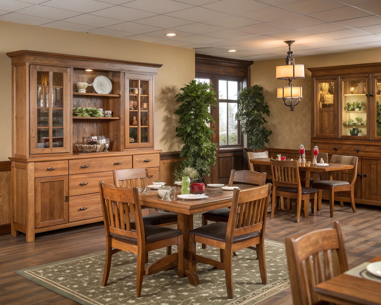
Spaces thrive on rhythm. Just as color repetition ties a palette together, repeating key wood tones gives coherence even when species differ.
- Repeat each tone at least twice: a walnut dining table and matching picture frames, or pine shelves echoing the tone of a nearby chair leg.
- Keep variety in function, not tone: one dark tone on large furniture, another repeated in smaller pieces such as stools or trays.
- Introduce contrast sparingly—one wood that stands apart creates interest, but more than two strong contrasts feel dissonant.
A room works like a melody: repetition sets the tune; contrast adds the accent.
5. Mind the Finishes and Sheens
The finish of a wood can completely shift how it’s perceived. Satin, matte, or high-gloss surfaces all reflect light differently and can either calm or amplify surrounding tones.
Guiding principles:
- Keep sheens consistent across visible pieces to maintain a cohesive texture.
- Matte or oiled finishes preserve wood’s natural feel—ideal for relaxed, organic interiors.
- Semi-gloss or lacquered finishes introduce formality and light reflection.
Tip: If you have mixed finishes by necessity, bridge them through accessories—pair a glossy walnut sideboard with matte black iron and woven textures to ease the transition.
6. Use Materials as “Visual Buffers”
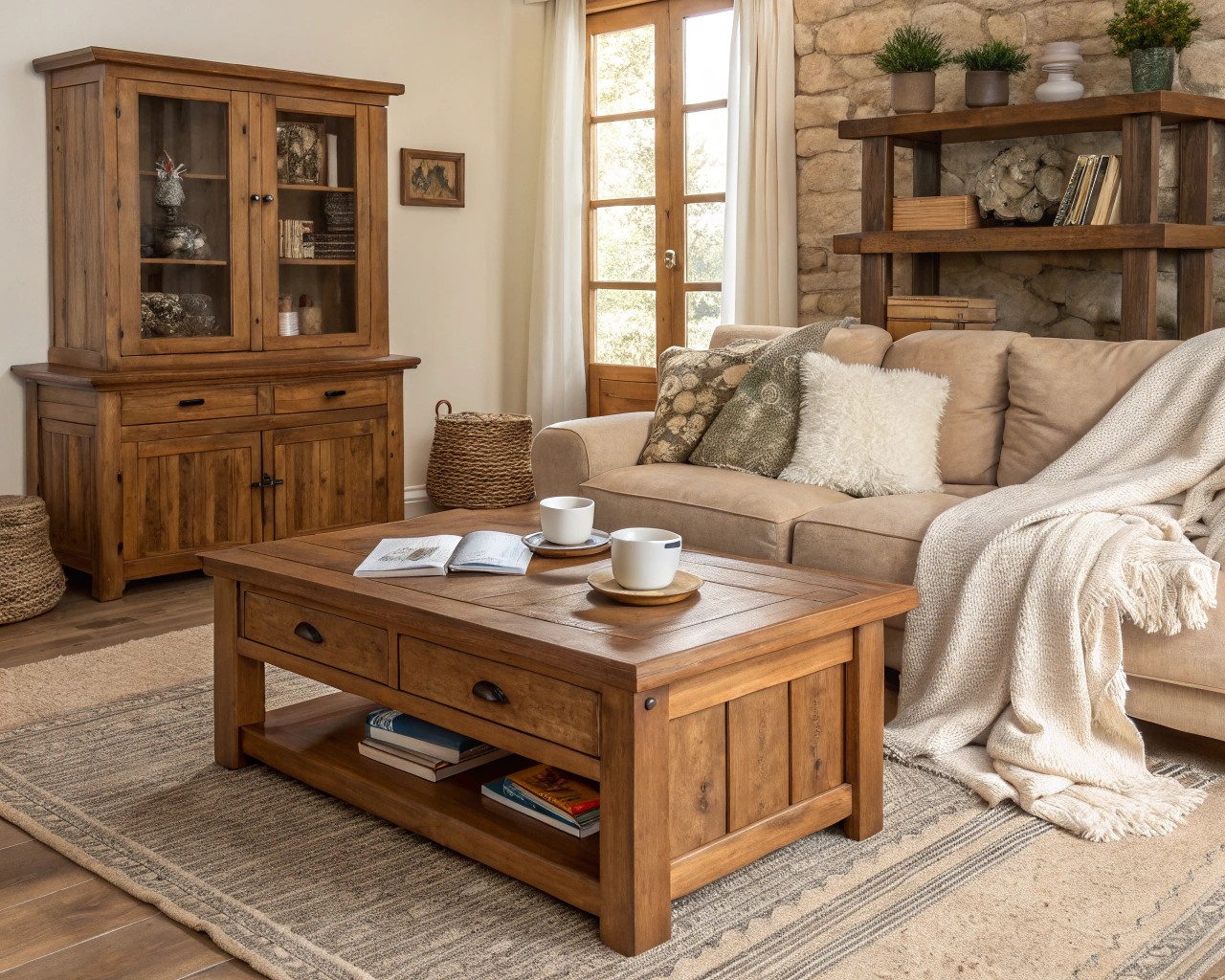
Non-wood materials act like punctuation marks—they give the eyes a rest between tones. Soft neutrals and natural textures maintain calm when wood is abundant.
Balancing materials:
- Fabrics: linen, bouclé, and wool keep the palette from feeling too rigid.
- Rugs: use jute or sisal to neutralize contrast between flooring and furniture.
- Metal: brass complements warm woods; chrome or blackened steel pairs well with cool ones.
- Stone: light marble balances heavy walnut; darker soapstone complements pale oak.
For rooms with three or more visible wood types, at least two other natural materials should appear in equal measure.
In one of my favorite living room projects, a pale ash floor met rich walnut shelves—but it was the textured wool rug and linen drapes that kept the blend peaceful.
7. Test Combinations in Real Light
Wood finishes are chameleons—changing dramatically under different lighting conditions. Before committing, bring samples home and observe them in both daylight and lamplight.
Testing checklist:
1. View samples vertically and horizontally. Wood reads differently on walls, floors, and tabletops.
2. Evaluate under morning, afternoon, and evening light.
3. If possible, finish a small section or sample board in your chosen stain and live with it for a few days.
Smart testing saves costly repainting, restaining, or buyer’s remorse.
8. Create Intentional Contrast
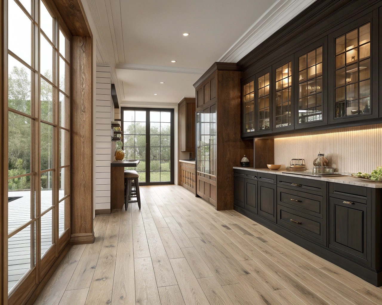
Complete uniformity can make a room feel safe but dull. Slight contrasts—light next to dark, matte beside satin—create a dynamic that feels designed, not accidental.
Contrast ideas:
- Pair pale oak floors with espresso-toned side tables.
- Balance dark cabinetry with light acacia shelves.
- Use black hardware or trim to give definition between similar mid-tones.
Rule of thumb: If two woods are close in tone, separate them with a clear line of light (a countertop, rug, or metal element).
9. Don’t Overdo the Variety
There’s a threshold where richness becomes clutter. Limit yourself to three distinct wood tones per room:
1. A foundation tone (dominant).
2. A secondary tone (supporting).
3. An accent tone (for smaller elements like frames or stools).
If you crave more variation, keep changes subtle—adjust by finish depth or grain direction rather than color.
10. A Living Palette
Wood is alive—it darkens, lightens, and shifts over time. That’s part of its magic. Don’t aim for freeze-frame perfection. Instead, design with flexibility: allow for patina and natural wear. Those shifts aren’t flaws; they’re layers of story and use.
When you embrace that living quality, your interiors evolve gracefully rather than aging abruptly.
Reflections on Craft and Comfort
Successful wood mixing is both art and observation. It’s about creating relationships—between tones, textures, and finishes—that feel intentional and lived-in. When in doubt, return to balance: one tone that leads, one that supports, one that surprises.
Bringing woods together isn’t about matching—it’s about conversation. And like any good conversation, it’s richer when each voice feels heard.

